Logo

Status
Not open for further replies.

CrealBilly

New User
Jeff
I'm having a newly designed logo made for MCS. The process has just begun and is in the "sketching" phase. I told them to keep it simple, with a beaver looking up the tree as he is felling it. I like simple... Simple is good to me.

I think I like the one in the upper lefthand corner the most and may ask them to further develop that one. Which ones do like?
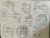
 

Attachments

  • uploadfromtaptalk1426617496037.jpg
    uploadfromtaptalk1426617496037.jpg
    295 KB · Views: 186

jazzflute

Kevin
Corporate Member
I would suggest you choose one where the type is not integral to the graphic, so that if you want to use the type in a stand-alone application it can still be recognizable as part of your logo. I would also avoid vertical type as it tends to be hard to both read and repurpose.

K
 

CrealBilly

New User
Jeff
Thanks guys :) here my first logo. I want to retain the beaver felling the tree. I especially like his eyes watching the tree as he felling it.

MCS%20LOGO%20SMALL.JPG


One of the first paying jobs I had when I first got my sawmill was cleaning up after some beavers near a pond. Let me tell you beavers a destructive creatures and make a huge mess. They will drop a huge tree, leave it lay and take whatever branches they think will work for their dam and den.

While working that job I came up with a slogan "Dam furry beavers make such a mess but Mills Custom Sawing makes lumber the best" and that's were the beaver logo came from.

Of course the real fun was blowing up the den and dam with dynamite that was pretty cool.
 
Last edited:

Mike Davis

Mike
Corporate Member
The color one looks great, if you are trying to use less color to reduce cost then keep it as close as possible to the original.

I agree to keep the graphic separate from the lettering. It is more useful and adaptable that way.

Use a standard typeface that reproduces well at all sizes.
 

KenOfCary

Ken
Staff member
Corporate Member
You ever think about changing sawing to sawyering or just sawyer? It sounds a little more professional to me, but might slide past some not familiar with the term. Just a thought.
 

CrealBilly

New User
Jeff
You ever think about changing sawing to sawyering or just sawyer? It sounds a little more professional to me, but might slide past some not familiar with the term. Just a thought.
That's the first thing they asked me. About playing around with the business name like saw mills and they had some other ideas as well. But I told them the business name is already registered in NC, IL and with the Feds. I really dont want to go through all that paperwork again...

I appreciate everyone's input here. I emailed them told them I like the upper left hand corner and middle one, so they are going to develop those a little more and send me new sketches to review by Thursday.
 

Gotcha6

Dennis
Staff member
Corporate Member
I like the upper left and center as well, but as a matter of clarification, beavers have a high mortality rate because they DON'T watch where the tree falls, often felling on them or other beavers......:eusa_thin
 

CrealBilly

New User
Jeff
I like the upper left and center as well, but as a matter of clarification, beavers have a high mortality rate because they DON'T watch where the tree falls, often felling on them or other beavers......:eusa_thin
Sucks to be a brainless tree falling machine doesn't it?
 

Hmerkle

Board of Directors, Development Director
Hank
Staff member
Corporate Member
Looks GREAT Jeff - one small comment - the beaver in many of the pictures looks "scared" (looking up and left or right gives that vibe) if that is what you are going for, good - else, try to suggest a little bigger smile, or cheeks, makes that look more mischievous...
my 2 cents - throw them away, keep 'em what ever! :cool:
 

CrealBilly

New User
Jeff
Looks GREAT Jeff - one small comment - the beaver in many of the pictures looks "scared" (looking up and left or right gives that vibe) if that is what you are going for, good - else, try to suggest a little bigger smile, or cheeks, makes that look more mischievous...
my 2 cents - throw them away, keep 'em what ever! :cool:
Great catch... that beaver does look a little worried because your truck is parked in felling distance and that beaver seen you entering the woods earlier with your AR15. He knows your gonna be ticked when you come back and find your truck crushed by the tree he's chewing on. :)

You think he should be a happy beaver?
 

Hmerkle

Board of Directors, Development Director
Hank
Staff member
Corporate Member
Great catch... that beaver does look a little worried because your truck is parked in felling distance and that beaver seen you entering the woods earlier with your AR15. He knows your gonna be ticked when you come back and find your truck crushed by the tree he's chewing on. :)

You think he should be a happy beaver?
:rotflm:

SERIOUSLY sitting here laughing out loud, because that is what I was thinking - "Gotta get this tree down before they catch me!"

NOT necessaraly a "Happy beaver"(will that get moderated?) but a "less scared beaver" (not much better...)
 

CrealBilly

New User
Jeff
:rotflm:

SERIOUSLY sitting here laughing out loud, because that is what I was thinking - "Gotta get this tree down before they catch me!"

NOT necessaraly a "Happy beaver"(will that get moderated?) but a "less scared beaver" (not much better...)
Well we could put a fat ole blunt in his mouth and have him holding a 40oz and make him into a stoner beaver. Maybe a bandana too? Then he wouldn't care about you, your truck or your AR. Just getting wood for the crib man, just wood...
 

Hmerkle

Board of Directors, Development Director
Hank
Staff member
Corporate Member
Well we could put a fat ole blunt in his mouth and have him holding a 40oz and make him into a stoner beaver. Maybe a bandana too? Then he wouldn't care about you, your truck or your AR. Just getting wood for the crib man, just wood...

Found this Googling "up in smoke beaver" looking for that '70's vibe
290397_487491047935626_2083512554_o.jpg


is this your mascot?
Bx08XAJCMAAyC-E.jpg


Stopping before I need to self-moderate!!!!
 

Rick M

New User
Rick
1. Center - reason: more balanced, would look better on a business card or sign because it's more compact
2. Upper Left - Still looks good but is more spread out and would take up twice as much space on cards, signs, etc. Also has a little bit of 'summer camp' vibe.

Either way, it's a good looking logo.
 

Gotcha6

Dennis
Staff member
Corporate Member
Sucks to be a brainless tree falling machine doesn't it?

Not if you get a deal signed by the History Channel to let a camera follow you and your buddies and call it "Axe Men".
You have to wonder what their salaries are for that show..........
 
Status
Not open for further replies.

Premier Sponsor

Our Sponsors

LATEST FOR SALE LISTINGS

Top