First CNC Job -- and Would be Grateful for Feedback

MarkDarby

Mark
Corporate Member
Hi All,
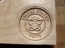
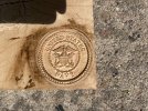
I just finished my first CNC cut and would be grateful for your feedback and suggestions. The diameter of the crest is 3". I used two tool paths to produce this. The first, with a 1/8" ball nose. The second, with a 31/1000" end mill. The wood is maple. The first picture is fresh off the CNC. The second is with a coat of shellac. I wanted the detail to pop, so I rubbed some gel stain on it -- and am not happy with the result. The stain remained in places where I didn't want it to. I did try using a dremel sanding wheel -- which helped some. I then finished it with a coat of lacquer.
Thoughts? How can I make this better?
IMG_3616.jpeg

Thanks,
Mark
 

Attachments

  • IMG_3617.jpeg
    IMG_3617.jpeg
    2.9 MB · Views: 120
  • IMG_3621.jpeg
    IMG_3621.jpeg
    5.2 MB · Views: 121

JNCarr

Joe
Corporate Member
The cut is actually very good for a piece that small. I dont know if a 1/32 taper bit would gain you anything, but you might try it.
I'm not a big fan of putting dark stain on maple even with a shellac sealer. You could try a much lighter stain applied as a light wash (ie diluted at least 1:1 with mineral spirits) then immediately wiped off would clean the high points but leave the crevices tinted. Shellac seal first as you did.
 

Echd

C
User
Looks pretty good to me. Finishing anything that intricate is always going to be tricky.

Try a tapered ball nose bit for your 3d carves.
 

blackhawk

Brad
Corporate Member
That is a good first carve. I always use a ball endmill for both the roughing and finishing toolpath on 3D carves. A flat endmill doesn't always give the best results. I would also work on your letter spacing. "NAVY" is spread a little too far apart. A few of the letters in "UNITED STATES" are too close together. For example, in the "ED", the letters are so close that the 1/32" endmill could not get fully between them. For letter spacing, I always trust my eye on what looks good. The spacing that your software automatically gives you is not always visually appealing.
 

Wiley's Woodworks

Wiley
Corporate Member
Getting an even coat of stain on a 3D carving may be next to impossible. In areas that stand proud of relief cuts all around them, you have more end grain exposed along the outer "sides" of the proud portion of the carving. We all know end grain soaks up more finish of any type than face grain. I doubt using gel stain has anything to do with the finish coming out uneven. Having pointed out what I think is the problem, I don't have a solution. It's the nature of the wood and has nothing to do with what finish you tried or how you applied it. My only suggestion is to select a wood closest in color to the finished color you want and apply the clearest finish that is appropriate for the piece's use.
 

mkepke

Mark
Senior User
Ass-u-me-ing what you're not happy about is the color change after the stain, I agree with Wiley: parts of your carving are taking up the stain differently based on the amount of exposed endgrain versus side grain. And you're using maple with is prone to splotching even in the side grain.

Also, you have very fine details, which make it a PITA to remove excess stain.

Try any of the normal strategies for controlling splotching and limiting uptake by the endgrain like a wash coat of shellac or commercial pre-stain conditioner.

For the problem of excess stain building up in the nooks and crannies try a dye or an oil finish, since neither have particles of pigment.

Anyways, it's looking pretty good 'in the raw' Mark !

-Mark
 

WallNutz

Bryan
User
That is a good first carve. I always use a ball endmill for both the roughing and finishing toolpath on 3D carves. A flat endmill doesn't always give the best results. I would also work on your letter spacing. "NAVY" is spread a little too far apart. A few of the letters in "UNITED STATES" are too close together. For example, in the "ED", the letters are so close that the 1/32" endmill could not get fully between them. For letter spacing, I always trust my eye on what looks good. The spacing that your software automatically gives you is not always visually appealing.
Not sure what software was used, or what is available to you, but I know that Photoshop has an option for text spacing called Optical (as opposed to Metric) which solves a lot of this. For example, the V in navy would be moved leftward so the top of it actually overhangs the bottom of the A. Visually it looks proper.

In any case I am impressed with this, first time or not!
 

bowman

Board of Directors, Webmaster
Neal
Staff member
Corporate Member
What was the fix for getting your CNC up and running?
 

MarkDarby

Mark
Corporate Member
Ass-u-me-ing what you're not happy about is the color change after the stain, I agree with Wiley: parts of your carving are taking up the stain differently based on the amount of exposed endgrain versus side grain. And you're using maple with is prone to splotching even in the side grain.

Also, you have very fine details, which make it a PITA to remove excess stain.

Try any of the normal strategies for controlling splotching and limiting uptake by the endgrain like a wash coat of shellac or commercial pre-stain conditioner.

For the problem of excess stain building up in the nooks and crannies try a dye or an oil finish, since neither have particles of pigment.

Anyways, it's looking pretty good 'in the raw' Mark !

-Mark
 

MarkDarby

Mark
Corporate Member
Hi mkepke...
Making a 2nd go at it today -- and will try a dye. If that doesn't work, will stick with the maple as it is. I did use a shellack wash on it before the stain. Hoping this one turns out better. If not.. will stick with undyed and unstained maple. Thanks a bunch!

Mark
 

Premier Sponsor

Our Sponsors

Top